
Newberry Color Theory
by Michael Newberry
Whether you are an artist or art appreciator who is curious about the process, this short book provides an interesting explanation of color dynamics using 16 pastel drawings of ocean waves as examples of the system in action. Newberry notes that his color theory was developed after writing about Van Gogh, Cezanne, and Monet for his book Evolution Through Art. “One of the things these artists did was to emphasize the color of vibrations of the air between them and the scene—like looking through a semi-transparent screen window.”
The Newberry color theory integrates four aspects of the scenery:
- atmosphere,
- “the things themselves”,
- light vs. shadow, and
- depth vs. closeness.
LOCAL COLOR. “For many artists and people looking at a landscape, they only see the color of things such as beige sand and blue sky. But when painted that way, the painting takes on an oversimplification… In visual perception, the sand isn’t just the color it is, but it is a result of rather complex interactions of factors.”
ATMOSPHERE. “The atmosphere is something like seeing through tinted glasses. A painting or drawing with atmosphere literally creates a feeling of airiness… and gives us a feeling of mood. The choice of the color for the atmosphere is based on looking at the whole scene, and anticipating what base color would work best with most of the elements… The importance of creating an atmospheric color cannot be understated… Because the atmosphere is color-driven, it has a beautiful color in itself, unlike dim gray.”
COMPLEMENTARY COLORS. “The perspectives of light vs. shadow and depth vs. closeness involve complementary colors, opposite colors such as red vs. green and yellow vs. purple… The color of a yellow highlight would have its complementary color, purple, mixed into its shadow. The same applies to spatial depth, the distance having a tint of one color, like blue, and the foreground using orange, blue’s complement. Complementary colors will tremendously enhance the feeling of light and dramatically stretch the spatial depth… Without the use of complementary colors, an artist would need to create more tonal contrast to give the highlights the same punch.”
Each of the 16 pastels was done on toned paper. The artist chose a wide variety of atmospheric colors across the series: green, yellow-gold, violet, pink, blue, red-violet, turquoise, gold-ochre, and peach for instance.
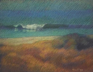
The light is usually a warm color (with a complementary cool shadow), but not always. In the drawing San Onofre: Blue-Violet, “the cast shadows of the main center wave has a bright lemon and orange color… These shadows become hotter the closer they get. This a great foil to the intense blue background, consequently [stretching] the spatial depth.”
The depth is usually cool (with a complementary warm foreground), but not always. Things start to get over my head when the author talks about “cool violet depth and warm greenish foreground” on page 26.
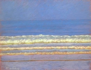
“This one has a yellow-gold atmosphere, yellow light, and purple shadows. Blue depth, and warm foreground. The light on the blue water is added with yellow light, the gold ochre of the atmosphere turning the water into variations on greens, and water’s shadows turn into a caca (ochre, blue, and purple). The grasses are a golden straw color mixed with extra doses of yellow and gold, and its mid-tone shadows are purple mixed with gold. It sounds complicated, and it is—the fun part is when it works, it is an amazing optical experience, and that is the exciting motivation to keep working the theory.”
“There is a light and color difference between the east coast and the west coast of the US. This is Apollo Beach near Cape Canaveral in Florida. The water is shallow, and the ocean bottom reflects towards the surface with lemony colors. The atmosphere for this pastel is lemon-yellow, with a pale green in the distance and pink in the foreground. The light is pinkish, with green-yellow shadows.”
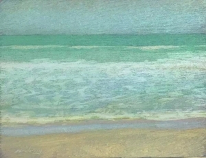
“What is important in this color theory is that the grays aren’t just grays; they are the result of different colors, such as pink and pale green, combined to make a shimmering gray, which gives more vitality and life to what would otherwise be dull.”

“The pinkish violet shadows in the white waves really set off the greenish highlights. Extraordinary combination.”
Newberry concludes, “There is an interesting difference between visual perception and sensory stimulation. Visual perception occurs when our minds extract the information—as I have done in this book—by breaking down the chaos into such categories as light, depth, and atmosphere. This enables us to see the big picture and not get overwhelmed by minutiae.”
In the final chapter, the artist details his materials, including how to use fixative and glassine to preserve the drawings as wells as the best anti-glare glass for framing.
Newberry, Michael. Newberry Color Theory. s.p, 2021. Buy from Amazon.com
Disclosure: As an Amazon Associate I earn from qualifying purchases.

One thought on “Newberry Color Theory”
Comments are closed.