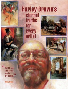
Harley Brown’s Eternal Truths for Every Artist
by Harley Brown
Harley Brown is an artist and art instructor who works in pastel and oil paint. In this book he shares his advice on how to paint a variety of subjects with attention to designing an interesting composition with harmonious colors and the integration of light and shadow.
First understand value. “Value refers to light and dark in a painting: the whole range of tones from white to black. When you understand value, color becomes almost automatic. When values are right, it doesn’t much matter what color you put in!”
“A painting must have a dominant value; either it’s light, or it’s medium, or it’s dark… The further you veer away from this principle, the weaker your paintings will be.”
“In a light painting, beware of exaggerating darks. When the dominant values are very light, we have a tendency to make the darks too dark. Against massive light areas, we see them as darker than they really are—an optical illusion.”
“Form shadows often have ambient light (coming from some secondary light source) kicking into them. Cast shadows usually don’t have as much ambient light in them… Cast shadows will usually have a sharper edge.”
“A cast shadow usually becomes lighter, and more soft-edged, the farther it is from the object that’s casting the shadow. It’s lighter because more ambient light bounces in to illuminate it. You can see this even on something as small as a nose. That shadow cast upon the cheek will get a little lighter the farther it is from the nose. The shadow edges will become more diffused at a distance too.”
“Nothing in the shadow has anything as light as in the light side.”
“Drama is created with carefully crafted lighting, mystery is achieved with shadow: concealing and revealing. It works best when peripheral details (like bookshelves, lampshade, the stuff on the desk) merge in the shadowed background in subtle, mysterious ways.”
Composition (Design). “In my opinion, design is the number one, most important part of art… Composition, not content, grabs your attention.”
“Leave out what’s not needed… Home in on one subject. More doesn’t mean better.”
“I begin with several thumbnail sketches, through which my approach to the subject is clarified. On these little sketches I arrive at size, placement, cropping, values, light against dark, and so on. In short, I make all of the important design aspects on these simple one-minute studies before committing color to paper or canvas.”
“In these little, quick sketches, don’t try to draw objects. Simplify everything to shapes. If your sketch works as an abstract composition, your painting will work too… Shapes are far more important than subject.”
Blocking in. “This is the step that will make or break your composition, as you lay in the pattern of values that first excited you about your subject… Avoid putting detail in both light and shadow areas.”
Measurements. “Trust me on this: without measuring, you will always, always be wrong in your proportions.”
Lost and Found Edges. “By softening or hardening edges or making them disappear entirely, the artist strengthens the illusion of form and gives a painting a dramatic flow. In ‘losing’ a shadow edge, we allow it to merge with an adjacent shadow, creating a link between objects that is one of the most powerful tools of pictorial design. You will see this link in many of the paintings on these pages, where values are allowed to run together, linking shapes and unifying masses.”
Linking shadows to create pattern. “You link shadows simply for the reason that you’re doing the painting in the first place: to create an interesting design… I bring some of these shadows together, combining them to create a larger shape, at the same time making that shape important and interesting… Light values in a painting can also be linked to create larger, more interesting shapes.”
“Most important, however, light and shadow should work together, flowing in and out of each other with interesting angles and edges to make appealing, abstract shapes.”
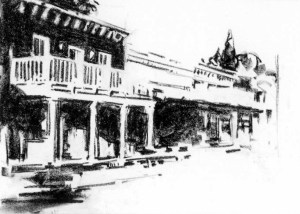
“The building is dark green. I’ve made it black. See how the white doors and windows play against it? How the windows merge with the porch railings? These are linked patterns… See how the railing ‘disappears’ into the white building at center, yet you know it’s still there. Background trees at right are a dark shape that defines the edge of the building.”
Create the center of interest. “You’ll want to soften edges, and reduce contrast, brightness and detail outside of what will become the center of interest… Remember that the eye is instinctively attracted to sharp edges and strong contrasts… Let me emphasize once again the importance of soft edges and lost edges, those magical ‘tricks’ we have at our disposal to move the viewer’s eye where we want it to go.”
Dynamic diagonals. “Lines and shapes moving horizontally or vertically convey formality, solidity. Diagonals convey movement and excitement… Every subject you see is going to have some diagonals in it. Your job is to strengthen those elements and perhaps downplay the more static lines. Even when painting a figure asleep, there still can be movement.”
Backgrounds and foregrounds. “The purpose of background and foreground is simply this: to expand the painting to the perimeter in an interesting way, isolating the subject at the same time uniting it with all the elements to form a cohesive whole. For that very simple reason, background, foreground, and subject should be developed more or less simultaneously.”
Reflected light. “It’s so easy to overdo… First of all, as you try to represent reflected light, you may easily wash out the shadows themselves, until they’re nearly as light as your lit areas. That breaks up the integrity of the shadow shapes, reduces the value difference between shadow and light, and everything ends up looking washed out and weak… When you encounter reflected light, keep in mind that it’s not as bright as you think it is.”
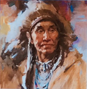
Highlights. “As you walk around your subject, a posed model for example, the lighting remains constant, but the highlights will travel with you as you move from one side to the other… A common mistake is to make highlights on the hair too light.”
Dominant color. “Most successful paintings have a dominant color… Creating a dominant color in a painting simply means making it more warm or more cool. In a landscape painting, for example, you’ll normally have many cools: sky, foliage, water, and so on, through the range of blues and greens. In a still life or figure painting, you’re more likely to utilize the warmer hues…”
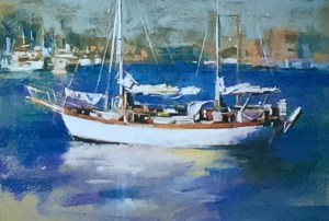
dominant color: blue
Munsell color system. Brown introduces the Munsell color wheel, arranged with five principal colors: red, yellow, green, blue, and purple. “The biggest change from the old three-primary system is the relationship between the colors. “Yellow is much closer to red on the Munsell wheel, which shifts the color complements: the complement of red, for example, is now blue-green instead of green. The complement of yellow is now purple-blue rather than purple.” Brown believes the Munsell system can be used to achieve better color harmony.
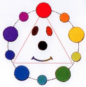
If dominant color is red, then discord colors are purple-blue, green-yellow.
Color harmony. Brown talks about discords, which I believe other books refer to as a triadic color scheme. “Discords are simply colors that are equidistant on the color wheel from the dominant hue and from each other. The easiest way to locate them is to draw an equilateral triangle on the Munsell color wheel… Discords bridge and add visual excitement when used sparingly, and in approximately equal amounts. You’ll often see them located near the center of interest.”
Desaturation (Grayed colors). “Too much intense color can ruin a painting, because the colors will appear to fight each other for attention… On the color wheel, the closer a color moves toward the center, the more the complement is introduced to it, graying and reducing its intensity.”
“As you experiment with high chroma complements and discords in small amounts, you will soon learn to use grayed versions of these colors with can occupy larger areas. The complementary color effect still takes place, and overall appearance is enhanced by its subtlety.”
“Strong color in shadow appears totally false. This is because strong chroma in a shadow is impossible.”
Temperature. “Warm shadows? Cool shadows? Generally speaking, when the light areas of a painting are going to be warm-toned, I like to use cool shadows. Conversely, when the light areas will be cool, I like my shadows to be on the warm side. That’s an oversimplification, of course, and there are exceptions to this. Quite often, you’ll have light bouncing into the shadows from someplace else, which affects both hue and value.”
“Go look at shadows in the real world. They’re… hardly ever the solid black they appear in photos.”
“Keep in mind that these warms and cools and reflected lights aren’t things you simply make up. They’re there to see in your subject… If you look carefully. Sometimes they’re very subtle, but it’s up to you to bring them out. And that’s a very good reason to work from life whenever possible. Not all these subtleties can be captured on film… Paint what’s in front of you, not what you imagine.”
Natural light. “I believe that natural light—preferably north light—is best for color decisions.”
“As afternoon progresses, sunlight becomes increasingly warmer in hue, and this tends to wash out the yellows in whatever it illuminates, making greens appear more blue, and moving oranges and reds towards violet. Because our eyes adjust and compensate, we’re often not even aware of this going on. But as artists, we can use this effect to advantage. A scene in late afternoon light, for example, will usually begin with warm lighting. Local yellows in the scene will be much closer to the yellow of the lighting, and other colors can be shifted towards blues and violets.”
“Any time of the day, as we look into the distance, yellows are also the first colors to be filtered out by the atmosphere. Reds go next, blues last of all. That’s why green hills and mountains march off to the horizon as purples and blues, and finally as fading grays way out yonder.”
Knowing when to stop. “Just about every painting ever painted was finished before the artist thought it was. We’re all guilty of putting in those extra, unnecessary strokes. The simple fact is that when the painting says all that you want it to say, it’s done.”
Brown, Harley. Harley Brown’s Eternal Truths for Every Artist. International Artist Publishing, 2001. Buy from Amazon.com
Disclosure: As an Amazon Associate I earn from qualifying purchases.
Book mentioned:Art Office: 80+ Business Forms, Charts, Sample Letters, Legal Documents & Business Plans by Constance Smith and Sue Viders (Second Edition, 2007)
Discover more from The Key Point
Subscribe to get the latest posts sent to your email.
