Blue and Yellow Don’t Make Green: How to mix the color you want—every time
by Michael Wilcox
“Have you ever wondered why it is so difficult to mix the exact colors that you need? And why it is so easy to mix dull, grayed colors, commonly known as mud?… In order to obtain a wider range of colors we purchase a variety of reds, yellows and blues, together with several greens, oranges, violets, browns, and grays. Painting starts to become expensive and confusing.”
The main premise of this book is that the three-primary color system needs to be abandoned in favor a six-color system. To begin, we need to understand how portions of the color spectrum are either absorbed or reflected by a surface. A surface appears black because it absorbs all colors. A surface appears white if it reflects all colors.
So what happens if you mix pure yellow and pure blue?
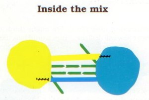
“The yellow pigment absorbs all light except yellow. The blue pigment likewise absorbs all but the blue portion of the light… The result is a dark gray, almost black. But how can this be? Everyone knows that blue and yellow make green. But blue and yellow do not make green.” They make black, because they absorb each other’s color. Likewise pure yellow and pure red make black; pure red and pure blue also make black.
“A yellow surface absorbs nearly all ‘color waves’ except the yellow which is rejected and reflected back from the surface to our eyes…If the yellow light reflected by the yellow pigment happens to meet up with another yellow particle, it is reflected again and is temporarily safe. If, however, it strikes a blue or red speck of pigment, it is absorbed.”
In practice, however, there are no pure primary pigments. So it is more helpful to understand the bias of pigments in order to predict how they will mix. “We have to change the way that we think.” The author introduces the Color Bias Wheel which consists of six color types:
- Orange-red such as Cadmium Red
- Violet-red such as Quinacridone Violet or Alizarin Crimson
- Violet-blue such as Ultramarine Blue
- Green-blue such as Cerulean Blue
- Green-yellow such as Lemon Yellow or Hansa Yellow
- Orange-yellow such as Cadmium Yellow

What happens when you mix impure yellow and impure blue? “A green-yellow such as Hansa Yellow… reflects some green as well as the yellow…. A green-blue such as Cerulean Blue reflects a large measure of blue, a reasonable amount of green and a tiny amount of violet.” The yellow and blue absorb each other, “but the green is reflected.”
In another example, violet is mixed three different ways. Mid-intensity violets can be made by mixing either orange-red with violet-blue or violet-red with green-blue. (Either the red or the blue can carry the violet.) “Violet-red and violet-blue produce the most intense of mixed violets, and for this reason: The light that enters this mix is robbed of its blue, red, green and orange content, but the violet, which is reflected by both pigments, escapes unhindered… Red and blue are mutually destructive; that is the basis of this approach to color mixing. As the red is added to the violet-blue it removes the actual blueness, leaving the violet that it contained.”
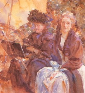
To understand colored grays, “it will be useful to study the painting Miss Eliza Wedgewood and Miss Sargent Sketching, by John Singer Sargent, as the artist employed a series of neutralized and grayed violets to good effect. The range varied from red-violets through to blue-violets and from slightly neutralized hues through to grays. Yellow, the complementary of violet, has been introduced to add contrast as well as harmony.”
“Grays are dark or nondescript colors that do not have a strong leaning towards any particular hue. When mixed from the complementaries they are often called colored grays. Neutrals are darkened or dulled hues, such as darkened red or green… When red, yellow, and blue (traditionally thought of as the artists primaries) are combined, the subtractive process destroys almost all of the light and the mix moves towards black. The process is known as ‘subtractive’ because light is always subtracted, or removed. If the intensities of the three hues are all equally balanced, they blend into a very dark gray, approaching black. The balance, remember, refers to intensity and not the actual quantities of paint.”
There are numerous exercises in the book as well as commentary on specific paint colors. For example, “It is most depressing to have to describe so many pre-mixed greens which are a disgrace to the profession of color manufacturing. So it is with some pleasure that I come to Pthalocyanine Green. A ‘clean’ vibrant blue-green produced by the further processing of Pthalocyanine Blue.”
The author explains how to use earth colors, including Burnt Sienna, Yellow Ochre, Raw Sienna, Raw Umber, and Burnt Umber.
“When deciding whether a particular color is a ‘brown’, remember that the general description of such colors is that they are darkened yellows, oranges, and reds… Of the brown that you use in a painting, design, or other type of work has been produced from colors already in use, the entire piece can be made to [harmonize] that much easier. In every case, the fewer colors the better.”
“Tints can be produced by either: 1) Allowing a white (or very lightly colored) background to influence thinly applied paint or, 2) By adding white paint. It is vitally important to [realize] that the brilliance of a color is damaged by adding white paint. It will also make otherwise transparent colors more opaque and add a certain ‘coolness’ to many mixes. This is particularly noticeable in watercolor painting, which relies heavily on clean, transparent, tints for much of its effect.” The author observes that watercolor purists cringe at the idea of dulling their paint with white, and yet “I can usually then find colors such as Naples Yellow in their paint box, which is basically a mixture of Cadmium Yellow and white (a convenience color which cannot be produced any other way).” The author describes the specific attributes of flake white, titanium white, and zinc white.
The author explains a way to determine the degree of opacity or transparency of paint by painting a swatch of color over a solid black line
“Blacks often upset the balance of otherwise harmonious arrangements. What better way to darken a hue can there be than to add its complementary… Perhaps the strongest argument against [the use of black from a tube] to portray dark areas is that the final result often looks more like a hole in the painting surface than part of the work.”
“Most areas deprived of light are closer to dark gray than black and in fact black itself is seldom found in nature. Many ‘blacks’, such as animal fur, bird feathers and fruits, are, on closer inspection, seething with subdued color. Depicted with black paint they take on a dead appearance. A mixed dark invariably looks far more natural, containing, as it does, some of the light that will be reflected from such surfaces. Even the interior of an unlit room in the dead of night does not look entirely black but a deep, shifting, atmospheric dark gray.”
The author makes an analogy of complementary colors acting as dimmer switches on each other, turning down the available light. They do in fact reduce each other’s reflected light. The important thing is that the light is turned down in a natural way. The nature of the color is not destroyed, as it would be if black were to be added.”
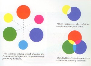
The author also explains why understanding additive mixing (mixing of light) is helpful to a painter. “During sunrise or sunset the sky often changes in color from a yellow near the horizon to blue in the higher regions… By gradually mixing yellow into the blue during the course of a painting, an area of green is created between the two colors. You may think this is normal enough. How else can it be painted? But consider what is actually being portrayed: It is an area of the sky in which yellow light is blending in to blue light. As we know, colored lights mix additively and since yellow and blue are additive complementaries, they move towards white when they are mixed.”
Printers use four process colors: cyan, magenta, yellow, black, also known as CMYK. “The printers ‘primary’ colors can only ever give dulled oranges… This is because the red used in printing is a violet-red (magenta). As the ‘color type’ name suggests, a violet-red carries a small amount of orange. Only mid oranges can result when it is mixed with a yellow. If the yellow used by the printer happens to be a green-yellow the oranges will be even duller than if and orange-yellow had been employed.”
“One of the major advantages of understanding color mixing is that you need only use a few carefully chosen colors. Chosen not only for color-type but also for lightfastness and other qualities.”
I find color to be very complicated. This book helps to makes sense of it with a logical, scientific approach.
Wilcox, Michael. Blue and Yellow Don’t Make Green: How to mix the color you really want–every time. 2nd ed. Whitchurch, U.K.: School of Color Publishing, 2001. Buy from Amazon.com
Disclosure: As an Amazon Associate I earn from qualifying purchases.
Discover more from The Key Point
Subscribe to get the latest posts sent to your email.

One thought on “Blue and Yellow Don’t Make Green”
Comments are closed.