Composition: Understanding Line, Notan, and Color
by Arthur Wesley Dow (1857-1922)
Composition is “the ‘putting together’ of lines, masses and colors to make a harmony. Design, understood in its broad sense, is a better word, but popular usage has restricted it to decoration.”
In the visual arts, “there are three structural elements with which harmonies may be built up” – line, notan, and color.
LINE
“The term LINE refers to boundaries of shapes and the interrelations of lines and spaces.” Dow’s definition of line encompasses the concepts of spacing and proportion.
“The study of Variation tends to lead the mind away from the conventional and humdrum, toward original and individual expression… In composition it is a most important element.”
“The designer and picture-painter start in the same way. Each has before him a blank space on which he sketches out the main lines of his composition. This may be called his Line-idea, and on it hinges the excellence of the whole, for no delicacy of tone, or harmony of color can remedy a bad proportion. A picture, then, may be said to be in its beginning actually a pattern of lines.”
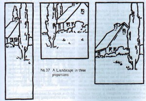
“At this stage of landscape composition, the idea of Grouping (Subordination) can be brought in, as a help in arranging sizes and shapes. There is a certain beauty in a contrast of large and small. It is the opposite of Monotony. For instance, compare a street where there is variety in the sizes of buildings and trees, with another of rows of dull ugly blocks. Ranges of hills, spires and pinnacles, clumps of large and small trees, clusters of haystacks, illustrate this idea in landscape.”
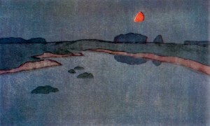
NOTAN – Harmony-building with dark-and-light
“As there is no one word in English to express the idea contained in the phrase ‘dark-and-light,’ I have adopted the Japanese word ‘no-tan’ (dark, light). It seems fitting that we should borrow this art-term from people who have revealed to us so much of this kind of beauty.”
“When this occurs accidentally in nature, say a grove of dark trees on a light hillside, or a pile of buildings against the morning sky—we at once feel the charm and call the effect ‘picturesque.’ The quality which makes the natural scene a good subject for a picture is like musical harmony.”
“The Orientals rarely represent shadows; they seem to regard them as a slight interest—mere fleeting effects or accidents. They prefer to model by line rather than shading. They recognize Notan as a vital and distinct element of the art of painting.”
“Notan of line. As long as the lines of a design are kept of uniform width, the beauty is limited to proportion of areas and quality of touch, but widen some of the lines, and at once appears a new grace, Dark-and-Light.” I assume Dow is referring to line weight.
NOTAN – Two Values
“Dark-and-light has not been considered in school curricula, except in its limited application to representation. The study of ‘light and shade’ has for its aim, not the creation of a beautiful idea in terms of contrasting masses of light and dark, but merely the accurate rendering of certain facts of nature—hence is a scientific rather than an artistic exercise.”
“The aim being to understand Notan as something by which harmony may be created, it is best to avoid Representation at first. Notan must not be confounded with Light and Shade, Modeling or anything that refers to imitation of natural objects.”
“The Oriental rug affords an excellent line-scheme for practice in notan. As composition it is a combination of two principles Subordination and Repetition.”
NOTAN – Three Values (or more)
“Clear black against clear white is a strong contrast; even the best of such work has some harshness, despite a sparkling brilliancy. A tone of gray, midway between these two extremes, changes their relations and opens up a whole new field for creative activity. Now we must think of different degrees of Notan—the ‘value’ of one tone against another.”
“The word ‘values’ refers to harmony of tone-structure; the value of a mass is its degree of light or dark in relation to its neighbors.”
“From three, it is an easy step to many values, and in these refinements of Notan lies the true meaning of the word ‘values.’”
“When beauty enters, the parts cease to have separate existence, but are melted together in a unit.”
COLOR
“The term COLOR refers to the quality of light.”
“Color, however complicated, may be reduced to three simple elements:
- Hue—as yellow, blue-green,
- Notan (or Value)—as dark red, light red
- Intensity (or Bright-to-grayness)—as intense blue, dull blue
Color harmony depends upon adjustments in this three-fold nature.”
INTEGRITY OF THE THREE ELEMENTS
“These three structural elements are intimately related. Good color is dependent upon good notan, and that in turn is dependent on good spacing. It seems reasonable then that a study of art should begin with line. One should learn to think in terms of line, and be somewhat familiar with simple spacing before attempting notan or color. There is danger, however, of losing interest by dwelling upon one subject too long. Dark-and-light massing will reveal the mistakes in spacing and stimulate to renewed effort. Color will reveal the weakness of dark-and-light.”
FIVE WAYS OF CREATING HARMONY
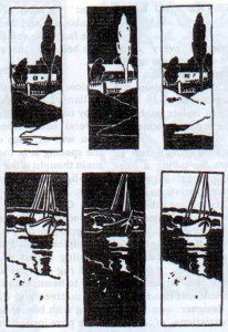
“Spacing is the very groundwork of Design. Ways of arranging and spacing I shall call Principles of Composition. In my experience these five have been sufficient:
- Opposition
- Transition
- Subordination
- Repetition
- Symmetry
These names are given to five ways of creating harmony, all being dependent upon a great general principle: PROPORTION or GOOD SPACING.”
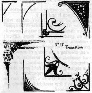
TRANSITION. “Two straight lines meeting in opposing directions give an impression of abruptness, severity, or even violence; the difference of movement being emphasized. If a third line is added, as in the sketches below, the opposition is softened and an effect of unity and completeness produced.”
SUBORDINATION. “To form a complete group the parts are attached or related to a single dominating element which determines the character of the whole. A tree trunk with its branches is a good type of this kind of harmony; unity secured through the relation of principal and subordinate, even down to the veinings of leaves—a multitude of parts organized into a simple whole.”
“A work of fine art constructed upon the principal of Subordination has all its parts related by delicate adjustments and balance of proportions, tone and color. A change in one member changes the whole.”
“This principal of Repetition is the basis of all music and poetry.”
“Harmony depends upon (a) good line design, (b) choice of hues, (c) quantity of each, (d) a dominating color, (e) notan values, (f) fine relations of intensity, (g) quality of surface, (h) handling. All these in perfect synthesis will be found in the works of the greatest masters. It is also true that simple harmonies are not difficult to realize, as is witnessed by primitive art and the best work of students.”
ART IS MORE THAN ACCURACY
“Mere accuracy has no art-value whatever.”
“The student under the spell of the academic dictum ‘Paint what you see and as you see it’ feels that he must put down every accidental shadow ‘just as it is in nature’ or be false to himself and false to art.” On the contrary, the artist must choose what to emphasize and what to exclude.
“No work has art-value unless it reflects the personality of its author. What everybody can do easily, or by rule, cannot be art… Every line, light, and dark must be part of a deliberate design.”
BEAUTY
“The powerful drawing of the masters is largely derived from other masters, not from copying nature. It is an interpretation with the purpose of attaining a high standard. Such drawing aims to express character and quality in an individual way—a thing quite different from fact-statement.”
“It is not the province of the landscape painter, for example, to represent so much topography, but to express an emotion; and this he must do by art. His art will be manifest in his composition; in his placing of his trees, hills and houses in synthetic relations to each other and to the space-boundary. Here is the strength of George Inness… He omits detail and rarely does more than indicate forms.”
“This relation among the parts of a composition is what we call Beauty, and it begins to exist with the first few lines drawn.”
“Pupils should look for character; that includes all truth and all beauty. It leads one to seek for the best handling and to value power in expression above success in drawing.”
The first edition of this book was published in 1899. Dow was greatly influenced by Ernest F. Fenollosa, curator of Oriental Art at the Museum of Fine Arts Boston in the 1890s. Dow later taught at Pratt Institute and Columbia University, where Georgia O’Keeffe was among his students.
Dow, Arthur Wesley. Composition: Understanding Line, Notan and color. Dover, 2007. Buy from Amazon.com
Disclosure: As an Amazon Associate I earn from qualifying purchases.
Discover more from The Key Point
Subscribe to get the latest posts sent to your email.
