How I Paint: Secrets of a Sunday Painter
by Thomas S. Buechner (1926-2010)
Paintings by Thomas Buechner hang in the collections of the Metropolitan Museum of Art and the Smithsonian American Art Museum. This book is primarily about technique, featuring dozens of the author’s still lifes, landscapes, portraits, and figures along with commentary about the process. “One purpose of this book is to make looking at pictures, at the surface of the original work, a source of insight and pleasure.”
The author writes about visiting the Metropolitan Museum of Art as a child. “The museum is called the Metropolitan Museum of Art, and contains just about every kind of thing that people once made. I assumed then, and still assume, that things were chosen because they were good—very good, maybe the best—examples of their kind. So I see art as a matter of relative quality rather than as confined to a particular discipline such as painting or sculpture.” This reflection is explored further in the book The Truth About Art: Reclaiming Quality by Patrick Doorly.
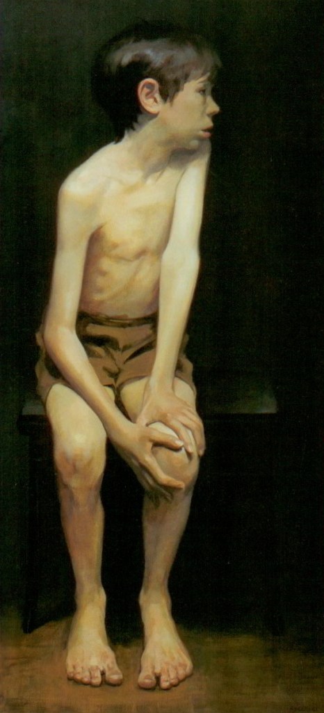
“What a painter thinks and feels about a subject is the real content of a painting.” This is a painting of a ten-year-old boy named Ian. “He is the subject, but the painting is really about uncertainty, about not knowing the future, not even being sure of the present.”
“I used to grind my own paint, make glue from chicken bones, and polish handmade gesso panels with an agate burnisher. I spent much more time on materials than I did on painting, and this is what I got: options. I learned how to make surfaces more or less absorbent, to make paint more or less translucent, thinner or fatter, runny or short, fast drying or slow drying. I learned different systems for laying on paint—Italian, Flemish, Dutch, English, and French—and how the hair of different animals—hogs, sables, badgers—delivers paint. I even learned ways to make paint look old. But most of all, I learned to keep things simple.”
“There is no right way, and each system has its advantages and disadvantages.”
“I have always been urged to draw; everyone told me that drawing is the essential prerequisite to painting and that nothing good could come of a painter who didn’t make drawings. But drawing and painting were always presented to me as separate activities. I now see them as inseparable… As this book shows, I draw as a stage in making a painting with a pencil, with charcoal, or with a brush. And sometimes as a finished work [such as] with Conté crayons.”
“Composing has to do with taking the viewer on a trip around a picture, with delights along the way and a final destination, a focal point of highest contrast. The bigger the picture, the more necessary composing is.”
“The ancient formula for what to paint from start to finish is to go from back to front: the background or the sky first; then the mountains, the trees, the house, the plough; and finally the foreground weed path. The nice thing about this system is that no edges have to be saved. If I don’t follow it, and paint the mountains first, I have to be careful not to disturb them when I put in the sky. I would rather take up the oboe than paint sky around the bare branches of a tree in a winter landscape.” Indeed.
“‘Chiaroscuro,’ the Italian word for painting in bright light and dark shades, is really about building dramatic space. Figures emerge into the light from vast empty darks, and they claim our attention as if they were alone in the universe. By emptying all visual information out of the shadows, we can heighten the impact of the limited tonal range of paint and actually portray a void, a subject without a context. Powerful stuff.”
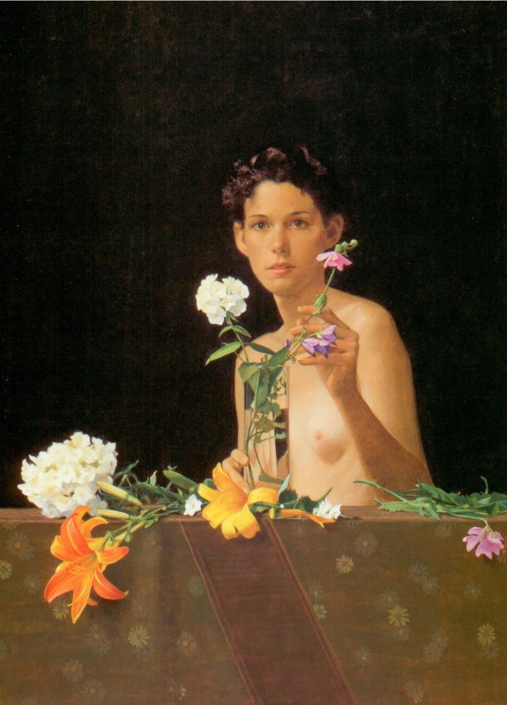
Buechner writes quite a bit about color temperature. “I paint dark colors over lighter ones, which makes them appear warm, and light colors over dark ones, which makes them appear cool… In Flora the flowers and brown cloth are painted over a lighter tone, while Flora herself is painted over a darker tone. The bright colors come forward, while the cooler flesh tones stay back. All this is relative: Flora is not painted over black but over a raw umber wash that is just a bit darker than her skin colors.”
“In painting people and things up close, aerial perspective is not an issue, but pulling them forward and pushing them back is, and so is making them look three-dimensional. If I can support my dark-light shading by changing the temperature of the colors as well, I can make the former stronger and more solid… All colors look cool over dark, even red and yellow; all colors look warm over light, even blue. This is the lesson of Rembrandt’s nose. It is the secret of the old masters, maybe the most important thing in this book.”
The notion of cool reds and warm blues is confusing if thought about in an absolute sense. I think the key to making sense of this is thinking about color temperature relative to what is adjacent. “All I have to do in order to get the right color in the right place is to ask myself: is it lighter or darker, warmer or cooler than the color next to it?”
Buechner talks about the effects of white paint. “I add white to any color, in order to make it cooler.” However, when discussing a painting of daffodils, he notes, “Adding white will only dull the yellow, and bright yellow is what these daffodils are about… I can’t get color brighter than straight out of the tube.”
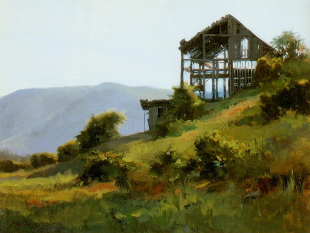
On a painting titled Barn Frame, Buechner scumbled (defined below) a thin layer of lighter paint over a darker blue, “which killed the luminosity and moved the mountains back (reminder: light over dark is cool, cool recedes). If you look between the posts in the barn frame, you can see what the original blue of the mountains was before I scumbled over it. The omission wasn’t deliberate. I forgot.”
“No subject ever looks quite the same, nor is a painter ever in exactly the same humor when he or she looks upon it.” Buechner made dozens of paintings of a local barn over a 25 year period. “Before going out to paint the barn, I had already put an imprimatura (a transparent middle tone) on the white surface, canvas or board, which gave me several advantages. I could paint lighter as well as darker, and, without the glare of a white surface, I could better judge the values, the relative darkness and lightness of the elements in my picture. Also, the transparent, luminous color of the imprimatura contrasted nicely with the opaque colors painted over it.”
“And then came the first box of watercolors, six disks of color, an impossible brush, and revelation! The more water I added, the lighter the color became. This is a great truth, and it holds for oil painting too: the more turpentine (or mineral spirits or oil or Liquin) added to any color (except white), the thinner and lighter it becomes when painted wet over a white surface. Color put on in this way has a sort of glow, because the lighter color underneath shines through the transparent glaze; it is impossible to get the same effect by mixing color with white paint and putting it on opaquely.”
Buechner describes the process of painting a portrait using transparent glazes on top of an underpainting. “In the underpainting I try to do two things: develop the dark-light design and model the forms. If I scrub raw umber over my fixed drawing and wipe it down to the color of brown paper (so the drawing shows through), I can paint over this imprimatur with more raw umber and it will be darker. The lights are built by adding white, thinly where I want it to look bluish and thickly for full light. And there is a little yellow ocher in the skin tone to keep it from looking blue. The middle tones are the brown imprimatur left untouched… I mixed up a middle flesh tone of burnt sienna and white, just a bit darker than the light tones in my underpainting. Painting this ‘skin’ thinly over the flesh areas gave me a warm color in the light areas and a cool color in the darks… After this step come transparent layers (glazes) of local colors, such as pink on the mouth and in the cheeks; yellows and greens (scumbles) in the reflected lights and shadows; and finally thick lights (impastos) of white tinted with various colors. I try to leave untouched the tones and colors of my underpainting wherever they will serve.”
Buechner writes about putting the finishing touches on a still life. “Finally come the small color touches—the green on the leaf, pinks on the stem—and a big, thick, opaque light of cadmium yellow and white on that aggressive pear, providing the highest contrast in tone, color, paint texture, and sharpness of edge with the dark on the leaves. After all, painting is about attracting and directing attention through relative contrast.”
“When I think a picture is finished, I put it in another place, away from the subject on which it was based… First, I decide what the picture is really about and what I can get rid of, what is not contributing to the central idea, what is distracting. Usually, these problems are caused by small contrasts that divert attention, such as shifts in color or value, or intricate details painstakingly observed and proudly rendered. I painted them because I saw them, but that’s not reason enough… Extraneous matter in a painting can really weaken the impact. I either paint it out or reduce the contrast.”
What about deep meaning? “When I read a good art-historical analysis of some familiar masterpiece, I am always amazed by the profundity of the artist. Did he or she really think all that out? Is everything a conscious communication? Is the viewer actually aware of these brilliant subtleties? … My work reflects my taste as much, if not more, than my intellect. How bright I make a color has to do with what I think and feel looks good, not with the symbolic nature of the hue or with grabbing someone’s attention.”
The book includes a glossary of 25 art terms. For example:
- Glaze. “In oil painting, a thin, transparent layer of paint applied over a dry, lighter-colored underpainting to produce a luminous effect impossible to achieve with opaque colors.”
- Imprimatura. “In oil painting, a first layer of color covering the entire surface to provide a middle tone of a unifying color for the work that is to be painted over it.”
- Scumble. “A layer of opaque paint brushed or dragged lightly over a surface so that the colors underneath are not entirely obscured. The term can also refer to translucent, lighter color painted over a darker one to cool and dull the effect. In this sense, the scumble has the reverse effect of a glaze, which warms and brightens.”
Buechner was the founding director of the Corning Museum of Glass (1950-1960), director of the Brooklyn Museum (1960-1971), and president of the Rockwell Museum in Corning, New York (1976-1985). He also wrote the biography Norman Rockwell: Artist and Illustrator.
Buechner, Thomas S. How I Paint: Secrets of a Sunday Painter. Harry N. Abrams, 2000. Buy from Amazon.com
Disclosure: As an Amazon Associate I earn from qualifying purchases.
Discover more from The Key Point
Subscribe to get the latest posts sent to your email.
