Color and Light: A Guide for the Realist Painter
by James Gurney
James Gurney has a talent for explaining complicated topics in simple language. Each of 90 topics is explained on a 2-page spread, illustrated with the author’s plein air, portrait, and fantasy paintings—he is the creator of the Dinotopia series. Color harmony is a recurring theme.
“Viewers will see the subject, but feel the color and light.”
“FALL OFF. The brightness of any point-source illumination diminishes rapidly with distance. This weakening of light is called fall-off. It diminishes according to the inverse square law, which states that the effect of a light shining on a surface weakens at a rate comparable to the square of the distance between source and surface.” Thus, at twice the distance, the light is only one fourth as bright “because the same rays must cover four times the area. At three times the distance, it drops to one ninth as bright.”
SHADOWS. “The terminator… is the area where the form transitions from light into shadow… You can cast a shadow with a pencil on the object to test which areas are in light and which are in shadow. The cast shadow will show up only on the lighted side and not the shadow side.”
“Within the shadow is not darkness but the effect of other, weaker sources. Outdoors, the blue light from the sky usually modifies the shadow planes, depending on how much they face upward. Reflected light often raises the tone of the shadow. It comes from light bouncing up off the ground surface or from other surfaces.”
Just beyond the terminator is the core of the shadow. “The core of the shadow only forms if the secondary source of light (edge light, reflected light, or fill light) doesn’t overlap too much with the main light. Keeping the core intact—or painting it in even if you can’t see it—can give the form more impact. If you’re setting up a model or maquette, you can place the primary and secondary lights just far enough apart so that you can see the core beginning to appear.”
More fun facts about shadows:
- “In soft, diffuse light, such as overcast light, there is no distinct light side, shadow side, terminator, or core.”
- “In bright sunlight, a newspaper in shadow is darker than a black shirt in the light.”
- “The darkest parts are usually at the points of contact, called occlusion shadow.”
WARM LIGHT, COOL SHADOW? “Most of the time we think of shadows as blue. Surfaces in shadows do tend toward blue if they are facing upward beneath an open stretch of sky. We can make a general rule if we hedge it a bit: Upfacing planes in shadow are relatively blue on a clear, sunny day.”
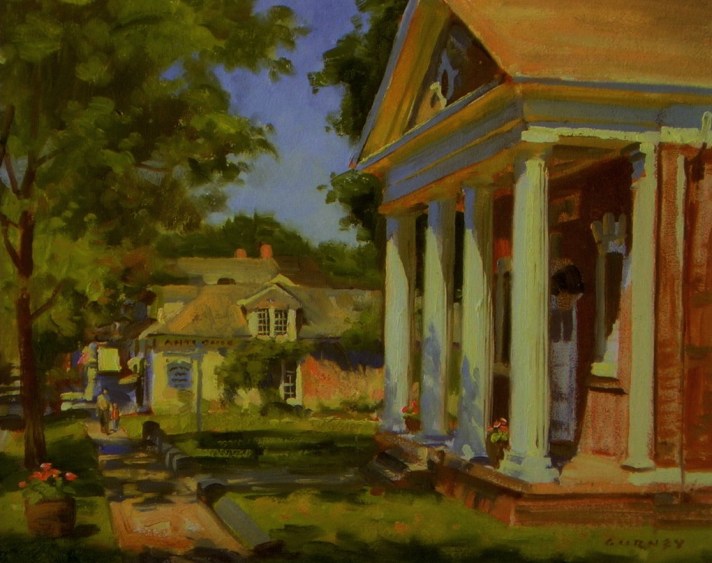
“In the sketch of the library in Millbrook, New York there’s plenty of blue color in the cast shadows on the sidewalk, for example. But planes in shadows that face downward are different because they pick up the warm reflected color of illuminated surfaces below them. You can see this effect in the white pediment above the columns. Where the projecting forms face downward, they’re distinctly warm, not blue at all.”
LIGHTING A MODEL. “Most portraits are painted with light coming from about 45 degrees in front of the model.” This is called three-quarter lighting. “The light emphasizes the nearer or broader side of the face, so it’s also called broad lighting.”
Rembrandt lighting “is arranged so that the nose shadow merges with the shaded side of the face.”
“Light that shines directly toward a model from the viewer’s perspective is called frontal lighting… Very little of the shadow is visible… Frontal lighting emphasizes two-dimensional design instead of sculptural form. It’s a good lighting to choose if you want to emphasize local color or pattern—to feature a fashion or costume, for instance. And it’s one of the few times when outlines actually appear in real life. The outline is really the thin fringe of shadow that appears at the very edge of the form. That line… varies in weight in proportion to the width of the plane that is turning away.”
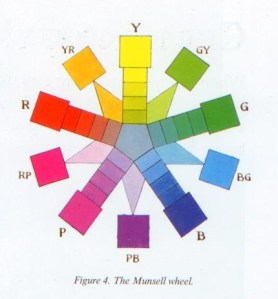
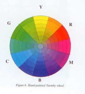
COLOR WHEEL. “The spacing of the colors on the traditional wheel is out of proportion… It expands the yellow-orange-red section of the spectrum too much.” This matters because the complementary colors 180-degrees across the color wheel will not be true complements. Two alternative color systems are introduced. In the Munsell System, “the structure is based on ten evenly spaced spectral hues.” On the YURMBY Wheel, “placing RGB on the wheel evenly between CMY creates a universal color wheel… What’s important is that you know where the colors you’re using actually belong on a mathematically accurate color wheel.”
Interestingly, the Munsell and YURMBY color wheels are not the same. So which is truly accurate? This reminds me of a quote from British statistician George Edward Pelham Box (1919-2013): “All models are wrong, but some are useful.”
CHROMA. “Every color can be defined in terms of two dimensions: hue—where it appears around the edge of the color wheel, and chroma—how pure or grayed-down it appears… The third dimension to consider for any color mixture is the value”—how light or dark. Although the words chroma and saturation are often used interchangeably, the author points out that they actually have distinct meanings. “Chroma is the perceived strength of a surface color, seen in relation to white. Saturation, a related term, properly refers to the color purity of light.”
GRAY. “Grays and neutrals are the opposite of intense colors. We sometimes associate grays with blandness or dullness, but they are actually an artist’s best friend.” Gurney says more paintings fail because of “fruit salad disease” than too much gray.
“To preserve pleasing variations in grays, it’s a good idea to mix them from complementary pairs, rather than from white and black pigments. Try mixing grays from blue and orange, red and green, or violet and yellow. You can then place those color accents near the gray, and they’ll harmonize, because the gray contains an element of each of them.”
GREEN. Gurney recommends mixing your own greens from blues and yellows rather than using green from a tube. “The resulting mixtures will be weaker and more varied, both qualities that you want.”
COLOR GRADATION. “A color gradation transitions smoothly from one note to another. The shift can occur from one hue to another, or from light color to a dark color, or from a dull color to a saturated one… John Ruskin observed in his landmark book Modern Painters (1843) that a gradated color has the same relationship to a flat color as a curved line has to a straight line. He noted that nature contains movement or gradation of color both on the large and the small scale, even down to the smallest brushstroke or pebble: ‘Nature will not have one line nor color, nor one portion nor atom of space without a change in it. There is not one of her shadows, tints, or lines that is not in a state of perpetual variation.’”
TINTS. “A tint can be made in two ways. One is by adding white, which will often make hues bluer. Whitened reds, for example, usually become more magenta. The other way is to apply the color as a thin, transparent layer over white. This usually leads to a more highly chromatic tint… Tinting strength refers to the ability of a pigment to maintain chroma with the addition of white. Pigments can also be rated according to their transparency or opacity, or covering power… To make these high-key tints appealing, it helps to use darker-toned colors in other parts of the picture for the sake of contrast.”
PIGMENT ATTRIBUTES. “Each pigment has the three attributes of hue, value, and chroma. It also has other properties, including transparency, drying time, and compatibility with other pigments. Experience and experimentation are the way to get to know your materials.”
“Lightfastness is the resistance of a given pigment to fading as a result of exposure to light… The quinacridone family of reds were developed for the automotive industry, which needs pigments that can stand up to years of brutal exposure to the sun. Pyrrole red, also called Ferrari red for its use on sports cars, is the same bright and reliable pigment in the oil paint called Winsor red.”
Another fun fact: The opposite of lightfast is fugitive.
“Some color names, such as ‘cadmium yellow light’ need decoding. ‘Light’ doesn’t mean higher in value; it means leaning toward yellow. ‘Deep’ means leaning toward red.”
I must confess, yellow leaning toward yellow is an odd concept to wrap my head around.
GLAZING. “A glaze is a transparent layer applied to an existing dry passage of paint, usually to intensify, deepen, unify, or otherwise change the color. A blue sky or a red cheek can be made richer by glazing. The glaze is distributed in a transparent medium… These transparent pigments act like stained-glass windows… Transparent paints are usually applied to a white ground, the whiter the better. The brilliance of the colors depends on the amount of light that is able to bounce off the surface.”
LIMITED PALETTES. “A limited palette (also called a restricted palette) is a small selection of pigments, often resulting in a painting with a more unified or harmonious effect.”
“A landscape palette doesn’t need too much chromatic firepower, unless you’re painting flowers or sunsets. The following four will give you pleasing muted harmonies, good for a lay-in: Titanium white (PW 6), Venetian red (PR 101), Yellow ochre (PY 43), and Ultramarine blue (PB 29).”
“For figure painting in the studio, you can get by with the palette that served old masters from Rembrandt van Rijn to Anders Zorn: Titanium white (PW 6), Yellow ochre (PY 43), Cadmium scarlet (PR 108), and Ivory black (PB 9).”
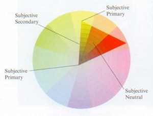
GAMUT MAPPING. “The entire group of possible colors for a given painting is called the gamut. It’s shown as a polygon superimposed over the color wheel. Good color comes not just from what you include in the composition but from what you leave out of it.”
“With this method, you will be thinking more about reaching for accents. Harmony and unity are a given, because they’re built into the process… The color note that appears in the geometric center of the gamut is the subjective neutral for that given color scheme. It’s the mixture midway between all the extremes.”
“If you can describe a color scheme by drawing the gamut shape on top of a color wheel, why not cut a mask of that shape out of a separate piece of paper or plastic? Then you can slide it around on top of the color wheel to generate new schemes.”
GOLDEN HOUR. “Color changes at day’s end. The sun is so low in the sky that its light travels almost parallel to the surface of the earth. A ray of light intersects the sphere of the earth on a line of tangent, like a needle pushed into an orange peel at a very shallow angle. Sunlight travels through many more miles of atmosphere at this angle than when it’s coming steeply down to earth at noontime. Because of the greater distance traveled, more blue wavelengths are scattered out of each parcel of light. This makes the sky above a richer blue.”
SKY AND CLOUDS. “The sky is not a flat, even blue. There are two overlapping systems of color gradations in a daytime sky. One system, solar glare, is governed by the proximity to the sun. The other, horizon glow, depends on the angle above the horizon… The higher clouds are whiter and the lower clouds are more yellow or red.”
WATER. “When light rays angle down toward the surface of still water, some of the rays bounce off the surface (reflection) and some travel down into it (refraction). If the water is shallow and clear, we’re able to see the bottom, thanks to refracted light… At steep angles, more light refracts into the water. At shallow angles, more light reflects off the surface.”
“Since some of the light touching the water penetrates it rather than bouncing off the surface, the reflection of a light object in water will appear slightly darker than the object itself. Light objects might be clouds in the sky, a white house, or light-colored foliage.”
OBSERVED COLOR vs. LOCAL COLOR. “Serial painting is the creation of multiple plein-air studies of the same subject under different lighting conditions… The experience of painting a series of the same subject brings up an important principle: The colors that you actually mix for a landscape painting often owe more to the particular conditions of light and atmosphere than to the local color of the objects themselves.”
IT’S ALL RELATIVE. “Compare, compare, compare. In a given scene, colors and values are known by their relationships rather than by absolute values… The color you mix is almost always shifted away from the local color.”
The book covers the following topics. Sources of Light: direct sunlight, overcast light, window light, candlelight and firelight, indoor electric light, streetlights and night conditions, luminescence, hidden light sources. Light and Form: the form principle, separation of light and shadow, cast shadows, half shadow, occlusion shadows, three-quarter lighting, frontal lighting, edge lighting, contre jour, light from below, reflected light, spotlighting, limitations of the form principle. Elements of Color: rethinking the color wheel, chroma and value, local color, grays and neutrals, the green problem, gradation, tints. Paint and Pigments: sources of pigments, lightfastness, warm underpainting, sky panels, transparency and glazing, palette arrangements, limited palettes, the mud debate. Color Relationships: monochromatic schemes, warm and cool, colored light interactions, triads, color accent. Premixing: mixing color strings, gamut mapping, creating gamut masks, shapes of color schemes, mixing a controlled gamut, color scripting. Visual Perception: a world without color, moonlight, edges and depth, color oppositions, color constancy, adaptation and contrast, appetizing and healing colors. Surfaces and Effects: transmitted light, subsurface scattering, color zones of the face, the hair secret, caustic, specular reflections, highlights, color corona, motion blur, photos vs observation. Atmospheric Effects: sky blue, atmospheric perspective, reverse atmospheric perspective, golden hour lighting, sunsets, fog/mist/dust/smoke, rainbows, skyholes and foliage, sunbeams and shadowbeams, dappled light, cloud shadows, illuminated foreground, snow and ice, water—reflection and transparency, mountain streams, color underwater. Changing Light: serial painting. The book also includes a glossary and a pigment information chart.
I am not an artist, but I am fascinated by how the magic happens. This book gives me even greater appreciation for the number of variables a painter has to juggle to create a convincing representational painting, in addition to the basic drawing issues (composition, proportion, etc.).
Gurney, James. Color and Light: A Guide for the Realist Painter. Andrews McMeel Publishing, 2010. Buy from Amazon.com
Disclosure: As an Amazon Associate I earn from qualifying purchases.
RELATED READING:
- Life Lessons from Dinosaurs by James Gurney (2024)
- Imaginative Realism: How to Paint What Doesn’t Exist by James Gurney (2009)
- Blue and Yellow Don’t Make Green by Michael Wilcox (2001)
- Modern Painters by John Ruskin (originally published in 1843)
Discover more from The Key Point
Subscribe to get the latest posts sent to your email.