
Vision and Art: The Biology of Seeing
by Margaret Livingstone
Unexpectedly, the most fascinating art book I’ve ever read is written by a Harvard Medical School professor of neurophysiology. “This book is about vision—the process of receiving and interpreting light reflected from objects—and what art reveals about how we see.”
The book starts out with an explanation of light and the basic structure of our vision. Cones are used in daylight. Rods are used in dim light. “It is sometimes incorrectly said that rods are for discriminating luminance and cones are for color. The fact is that luminance (or value) and color are not distinguished along the rod/cone dichotomy. The distinction is made by the next cells in the hierarchy, the retinal ganglion cells…. In short, we see color by subtracting the different cone responses, and we see luminance by summing the different cone responses and the rod responses.”
The author labels two categories of brain functions as the What system and the Where system. The What system deals with object recognition, face recognition, and color perception. The Where system deals with “motion perception, depth perception, figure/ground segregation, and perceiving positional information.”
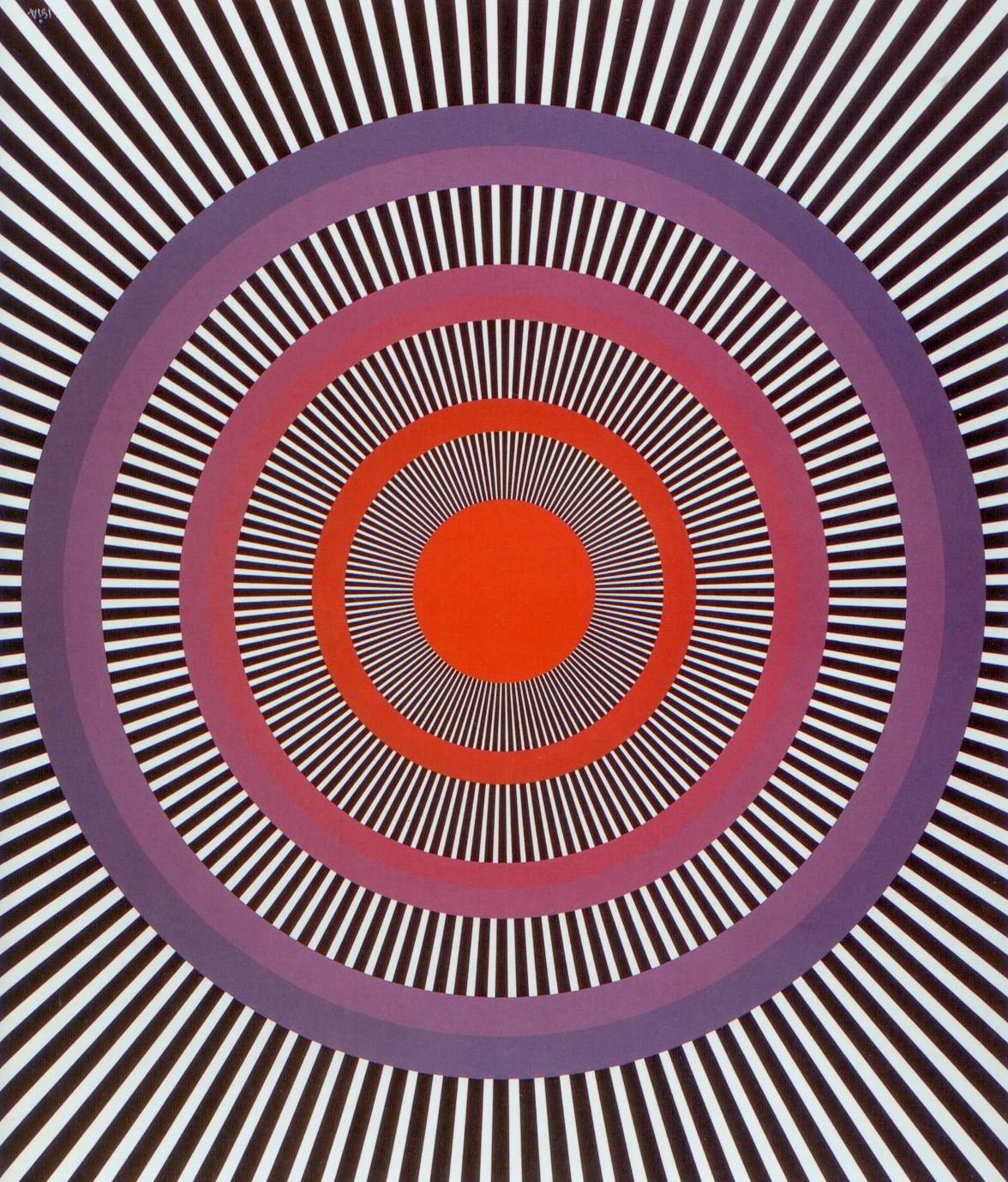
The book includes a wild illusion demonstrating the effects of equiluminance. The What system can discern the borders between the concentric circles because they are different colors. However, because the circles are the same luminance (or value) the Where system does not. “You should notice a streaming effect in the colored circles. The streaming moves perpendicularly to the high-contrast lines, which induce it.”
Claude Monet also used low luminance contrast to create an illusion of motion. The artist used equiluminant colors in Poppy Field to make the flowers “seem to flow and sway in a breeze.” In The Railway Bridge, equiluminant colors give the river a sense of illusory motion. In Impression: Sunrise, the sun is equiluminant with the sky. Although these effects are much more subtle than the concentric circles, the author modified Sunrise with a brighter, presumably more realistic, sun to compare the effect. “It paradoxically seems less vibrant.”
Monet also experimented with the low luminance contrast using little or no color contrast in Vétheuil in the Fog, which has the opposite effect. “Something defined by very-low-contrast contours is seen by the Where system, but not the What system and may seem to have depth and spatial organization but no clear shape or identity.”
“Painters who use watercolors or pastels… often exploit the low resolution of our color system by applying their color in a looser or blurrier way than the higher-contrast outlines of the objects; the color seems to conform to the outlines, even if it actually does not… We think the visual system defines the borders of objects using a high-resolution form system, and then it uses a lower-resolution color system to assign color to the object… Thus, color spreads to fill areas defined by the form system.” This is similar to the way a JPEG file efficiently stores shape and color information, as compared to a resource-consuming bitmap file.
The author briefly mentions Fauvism. “Luminance contrast, not color, is necessary for depth perception. A corollary of this is that you can use any hue you want, as long as you have the appropriate luminance contrast, and still portray three-dimensional shape from shading. This is particularly apparent in the work of the Fauves.”
What color would you expect when you mix yellow and blue—white, green, or gray? The answer depends on whether you are talking about additive, subtractive, or optical mixing.
- Additive – “When you combine red and cyan light you get hueless white. Blue and yellow light also mix to make white, as do any pair of colors of light in which the red-green and blue-yellow opponent activities are balanced. In other words, we see hue only if at least one of the color-opponent channels gives an unbalanced signal.”
- Subtractive – “When blue and yellow pigments are mixed you see only green light that is reflected by both the yellow and blue pigments… With pigments you are combining what absorbs, or subtracts, light.”
- Optical Mixing – “You may be surprised to read that if you mix yellow and blue paint on a palette you get a different color than if you paint tiny dots of yellow and blue, and then stand far enough away that they merge… I walked about 25 feet from the board and saw that the two patches both looked gray, not green. Then I used a toothpick to smear and mix the dots of one of the patches, which resulted in that patch becoming quite green… ‘Optical mixing’ means that adjacent colors blend as if light of the two colors were combined (additive color mixing) rather than like two pigments mixed on a palette (subtractive color mixing)… The Post-Impressionists did indeed achieve optical mixing of colors… The inks in magazine printing blend both additively and subtractively (that is, many of the colored dots are isolated… and therefore combine additively, but others are printed on top of each other… so they blend subtractively.”
“People often contend that black and white are not colors. But, subsequent to the photoreceptor stage, luminance is one of the three axes in color space… you cannot define every color without employing luminance. For example, the difference between brown and yellow or between maroon and pink is solely a difference in luminance, i.e. the position along the black-white axis. So black and white are indeed colors; they just don’t have any hue.”
“If you want to see what an artist saw while painting a picture, you should view the painting under the same light he worked in. It works the other way, too: If a painter knows a work will be displayed in bright daylight, he would do well to create it is bright daylight, or he may be surprised by how it looks when displayed; a painting hung in a dim corridor may evidence surprisingly bright blues, compared to its appearance in daylight.”
Does Mona Lisa change her expression? “Mona Lisa’s mouth—[when] seen by your peripheral, low-resolution, vision—appears more cheerful than when you look directly at it, when it is seen by your fine-detail fovea… Most of us are not aware of how we move our eyes around or that our peripheral vision can see some things better than our central vision… Facial expressions may be more apparent in the coarse image components than in the finer ones even in real life, because they depend on deep facial muscles, and changes in underlying muscle activity can be effectively blurred by subcutaneous fat. Therefore it may be that our ability to correctly interpret facial expressions in general is better in our peripheral vision than in the center of gaze.”
“Since our eyes view the world from slightly different positions, the images on the two retinas differ slightly. Stereopsis is the ability of the visual system to interpret the disparity between the two images as depth… People whose eyes are misaligned cannot see stereoscopic depth.” The author suggests that this may be an advantage for an artist. “If your visual system is poor at extracting depth, maybe you see the world as flatter than I do, and perhaps you have less trouble ‘flattening’ it onto a piece of paper… Gustav Klimt himself probably was stereoblind. His photograph shows that he was severely cross-eyed.” Studying self-portraits of Rembrandt, she believes he was also stereoblind. “We conclude that poor depth perception is not a detriment to making art and may even by an asset. But you don’t need to poke an eye out in order to be a good artist, since you can get exactly the same effect by closing one eye, which is a common trick taught in art schools to ‘flatten the scene.’”
Some of the many other questions answered in this book include:
- Why does an oil film on water make rainbow colors?
- Why are men more likely to be red/green colorblind than women?
- Why do cats’ eyes appear to glow at night?
- Why do film editors cut on motion?
- Why is equiluminant colored text hard to read?
- Why do we need reading glasses as we age?
- Why should you avoid eye contact with monkeys?
Additional topics include colored shadows, countershading, facial recognition, illusory depth, illusory motion, illusory borders, how color television works, dyslexia, and some bizarre visual disabilities which result from damage to specific parts of the brain.
Livingstone, Margaret, Vision and Art: The Biology of Seeing. New York: Abrams, 2014. Buy from Amazon.com
Disclosure: As an Amazon Associate I earn from qualifying purchases.
Discover more from The Key Point
Subscribe to get the latest posts sent to your email.
